 One of the hardest things I found when working towards becoming a published illustrator was finding my own style.
My illustrations varied from project to project, and though I was told that my versatility was a good thing, I felt I still needed something that said ‘this is a Katie Stewart illustration’.
As an artist, as opposed to an illustrator, my favourite medium was pastels. I loved the way I could work with the colour of the paper to compliment the colours I was using.
A winter scene on red paper shone like a sunny winter late afternoon, and a summer scene on purple accentuated the shadows and the yellowness of the dry grass. Doing illustrations in pastel though, would have been fraught with problems.
Scanning and keeping spreads, without losing vast amounts of chalk dust and smudging details, would have been a nightmare.
When my eldest son was around seven years old, we invested in our first computer. It was then that I started to write, having discovered the ease with which I could both write and edit on-screen.
I didn’t start using the computer for illustrating, however, until many years later when I discovered the Cintiq drawing tablet. This allows me to draw directly onto its screen in Photoshop with a stylus. I immediately decided that this was my medium for illustrating. Not only was it mess-free, it allowed me to be the perfectionist that I am. No longer did I need to re-do a whole illustration because of a perceived problem. I could simply delete a small portion or a layer and fix it in minutes. Despite that advantage, the problem with my lack of distinct style remained.
A few years ago, a publisher asked me if I could make my illustrations look less as if they’d been done on the computer. I saw her point. I was using fairly flat colour and shading with a smudge of a darker shade. It wasn’t very exciting. I set to work to experiment with what I could achieve with available ‘brushes’ for Photoshop.
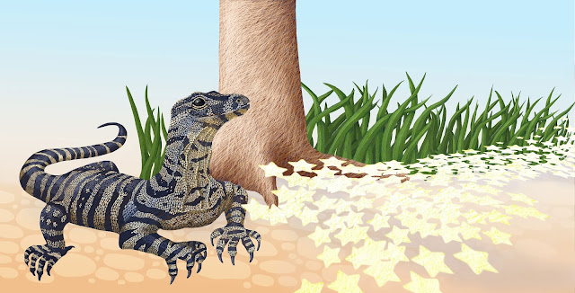
Nothing really satisfied me until I discovered a YouTube video that explained how to adapt brushes to suit your own needs. I adapted a brush and came up with a ‘pastel’. It’s angled and only covers some of the ‘paper’, as if the screen is textured. I can use it just as I used to use real pastels – on coloured background, crosshatching and building up the layers and colours to shape the object. Using clipping layers made it easy to cover an area, such as a character, without going out of the lines and then details like fluffiness could be added on a final layer without clipping. It had a look about it that I really liked. I finally had my style.
I submitted a book to the same publisher (Fremantle Press) with a couple of sample illustrations done in my new style. The children’s editor, Cate Sutherland, admits that she thought I’d done them in pastel. That book was published in 2019. I keep the backgrounds simple, if slightly abstract, to give the feel of the setting, but the characters and immediate surroundings are detailed. It’s a style I love to do and it seems to go down well with readers. I still experiment and may change things one day if a book suggests a different style, but for now ‘fake pastel’ is me.
Katie Stewart’s latest book Where do the Stars Go?is available in all good bookstores and online through Fremantle Press. Learn more about Katie by visiting her website or Instagram account @katiestewartillustrator.
May 28, 2021 at 12:35AM DimbutNice


