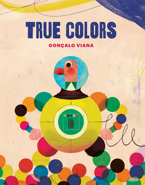
GV: True Colors started as a very straightforward story with a very simple premise: a tree and a cloud decide to swap places, causing an uproar in the village nearby that first sparks confusion, then anger and, finally, fizzles into acceptance. I showed it to Carla Oliveira at Orfeu Negro, together with most of the illustrations, and looking at both text and images together, it quickly became clear that I had made a rookie mistake. This was my first time writing a text for a picture book, and while composing the story I overlooked the fact that text and images, together, would be sharing the load of telling the tale. My text was too long and way too descriptive. So much so that it made the illustrations redundant. The same could be said of the illustrations, which already told the story all by themselves. The text wasn’t actually needed!
With this in mind and that fact that I’m an illustrator, it felt natural that the illustrations should tell most of the story. That, in turn, freed up the text to do something else. This was very liberating. Since the text no longer needed to tell the story it started reacting to it, following it along as a fellow reader. Commenting, trying to make sense of things, questioning.
LTPB: You used to be an architect, and I’m seeing a lot of geometrical shapes in this book! How do you feel like your background working in architecture with a math-focused lens informs how you illustrate children’s books?
GV: Illustration had always been a love of mine, from a very young age. I didn’t call it that though, I didn’t even know it existed as a professional choice. For whatever reason, in Portugal at that time, it was rarely mentioned as a career possibility. I wanted to make a living drawing somehow but seeing no real way to do that once I finished high school and not wishing to go the fine arts route, I started studying architecture. I finished my degree and worked as an architect in London for a few years. Illustration, the wanting to draw, never really faded, though it remained dormant.
When I returned to Lisbon, illustration was starting to boom in Portugal. Newspapers, which for long had used almost only photography, were now being spurred by a new generation of art directors to use more illustration. A friend of mine had started illustrating for newspapers. I wanted to do it too! He showed me the ropes, I prepared a portfolio and got a job doing political cartoons for a newspaper. Soon after I started doing illustration too, and left architecture.
Architecture didn’t leave me though. My initial illustration style was nothing like what I do nowadays. It was very curvy and sketchy, cartoon like. Slowly it started to change. Nothing radical or noteworthy, just a very gradual, almost imperceptible geometrization that started to show. It was a very slow process, and I certainly didn’t notice what was happening. It was only when I started to plan my layouts geometrically that I finally understood: I was doing architecture! Well, not really, but a similar thought process applied to illustration. I had studied and practiced architecture for almost eight years, it wasn’t just going to vanish from my mind. Over the course of two years it had been steadily seeping back into my work. Once I saw it I decided to commit to it, and it became a conscious and intentional process.
Architecture doesn’t like arbitrariness, buildings are usually planned following some kind of geometrical logic or rule. Even deconstructivist buildings, whose shapes seem almost random, do this by interlocking various axis and grids. I plan my illustrations this way. I find that this geometrical framework provides a solid foundation upon which I can then add a lot of more dynamic, even silly or chaotic elements, without the whole thing falling apart. I don’t do it tyrannically though, it’s an illustration after all, so there’s room for free and intuitive compositions as well.
LTPB: What did you use to create the illustrations in this book? How has your process evolved over the course of your (many!) careers?
GV: These illustrations were created digitally, from an initial pencil drawing, in Photoshop. I usually draw up a wireframe of the elements I’ll be painting. Just the basic shapes, lines and any hand drawn elements I might want to scan in. I then work the colours as I go. One of the advantages of working digitally is that the image remains ever editable. For me that means I can work my way methodically, adding elements and balancing the colours and composition as I progress.
I studied architecture and never went to art school. We did have drawing classes there but these were limited to pencil drawing. I ended up never properly learning traditional painting. It’s not like I couldn’t have tried to learn it by myself, but at the time I was a bit obsessed with the work of Argentinean cartoonist Quino, devoured all his books. All of his cartoons were drawn in black and white, plain line work, and I was intent on doing the same. Never did I think colour would become such a big part of my work, later on.
It was only when I returned to Lisbon that I dabbled in the prospect of becoming an illustrator and it dawned on me that, quite simply, black and white drawings weren’t going to cut it. A friend of mine showed me the basics of digital painting, and that became my medium. It was a very crude medium at first. Later, as digital drawing tablets started to improve, and–more importantly–better digital brushes became available, what was possible to do with it improved substantially. It would be wrong to say that this is my preferred medium because that would imply a choice. The reason I came to rely solely on it has more to do with serendipity and the circuitous route that brought me to illustration. I actually don’t know how to paint any other way. That said, more than the medium, what really matters is the work you do with it. The medium is just a means to an end.
GV: I’ve been working on a new book, but I can’t say anything about it for the time being. It’s very early in the process and the pandemic has delayed things even further. After True Colors I did illustrate a book I’m very happy with, an adaptation of L. Frank Baum’s The Wizard of Oz for younger children, written by Adélia Carvalho for Livraria Lello. I illustrated it during a time when we were in COVID lockdown here in Lisbon, and it was wonderful to stroll through the land of Oz while we had to stay at home. It became a happy place and the illustrations turned out even more colourful because of that.
LTPB: If you got the chance to write your own picture book autobiography, who (dead or alive!) would you want to illustrate it, and why?
GV: I’m not sure I would want to write a book about myself. But if had a book and I had to commission an illustrator for it, from the ones that are no longer with us I think I would love to have Miroslav Sasek. He’s good to a point that defies comprehension. Every illustration I see from him floors me. He is effortlessly good, like all great performers. When you see his work all of it seems to have stemmed gracefully out of his hand, naturally, like one could just easily do that which I myself, however hard I try, don’t think I’ll ever be able to achieve.
From my fellow illustrators of nowadays, for a picture book I think I would ask Isabelle Arsenault. Her illustrations have it all: playfulness, grace, colour, beauty, texture, and so much poetry. I’ve recently read Captain Rosalie, and it moved me to tears. It packs quite an emotional punch for a picture book. It’s down to the beautiful text and Isabelle’s subdued illustrations, the greyish landscapes Rosalie moves through with her fiery orange hair, the warm colours of Rosalie’s mother’s blanket that wraps them and warms the scene. It’s all so beautiful.

June 8, 2021 at 10:30AM noreply@blogger.com (Mel Schuit)


