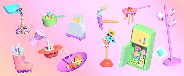
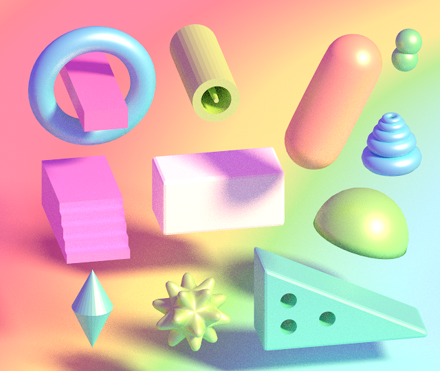
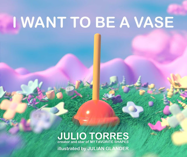
I got to catch up with digital illustrator, animator, and artist Julian Glander recently to talk about I Want to Be a Vase, written by Julio Torres. This is a surreal picture book, featuring ordinary household items as characters who all desire to be something they’re not, all against a brightly colored, 3D backdrop. Enjoy my chat with Julian and a peek into this unique world!
Shapes. You’ve heard of them. You might have even interacted with a few. But do you really know them? From plucky Plunger, who wishes to defy his shape and become a beautiful vase, to other household objects with dreams of a life beyond their predestined roles, I Want to Be a Vase takes readers on an essential and visually stunning journey through the lives and intimate dramas of often-overlooked household appliances.
Peek underneath the dust jacket:
Let’s talk Julian Glander!
LTPB: How did you become the illustrator of I Want to Be a Vase? What were the first images that popped into your mind when you saw Julio Torres’s text?
JG: I think I was recommended to Julio by a comedian friend of his named Max Wittert. I was already a huge fan of Julio’s off of his comedy special and tv series, and I *loved* the manuscript for this book. I felt there was a connection with a shared obsession with this certain subsection of 1990’s toys — polly pocket, injection-molded barbie playsets, beanie babies, and McDonald’s “girl toys”. So right away my instinct was to find that sort of shiny, simple, plastic-ness, seen from a little bit of a high angle as if we were looking into a dollhouse.
LTPB: Can you talk a little bit about the visual evolution of I Want to Be a Vase? As you got to know the characters (I think we can call them that!), how did your illustrations evolve?
JG: This ended up being a bigger project than I had realized at the beginning, and very much a team effort with me, Julio, art director Michael McCartney, and editor Julia McCarthy. It took about a year and a half from start to finish.
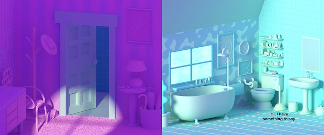
My original illustration test for the book was a little more out-there, zanier colors and patterns, and we pulled back towards something a little more subdued. Something I like to do in a lot of my illustrations is set up a whole scene in monochrome, with some “power colors” to accent important characters or details — in this book, whatever characters are speaking on the page are lit up in a special color.
Julio wanted the book to have an almost photographic feeling, and that was a miracle because that’s also how I approach projects like this. Instead of sketching layouts with pencil, I went straight into 3D and set up the main rooms of the apartment, and populated them with the main objects, almost like I was playing with a little miniature film set. I then moved the 3D camera around to “find” the shots.
Visually, the one character that changed the most was the Vacuum — they started out as a stand-up vacuum, but we found it was more interesting visually for it to be one of those little round hoover floor vacs, which I love.
LTPB: What did you find most difficult in creating this book? What did you find most rewarding?
JG: Julio came into the project with a bunch of rules—it was clear that he didn’t want to take the most obvious approach anywhere, and I loved that. For instance, he didn’t want the objects in the book to have faces, and he didn’t want to use speech bubbles. Michael set all the text for this book, using a meme-inspired approach of laying the text on top of the objects, giving them each a different font. I’ve seen a lot of people say they’ve never seen a children’s book that looks like this, that’s something we were all aiming for as a team and I think the text approach is a big part of that.
One of the things that pulled me into the manuscript was that it was written almost like a film script — there were lines like “we zoom in” or “the camera moves across the room” which, obviously, you can’t do in a literal sense in a static medium like a picture book. My favorite part of the book is probably the opening spread, where they gave us 8 text-free pages to do a slow, gorgeous zoom from a bird’s eye view of a city into the bathroom where the book takes place. It’s a pretty audacious way to open a kid’s book, I really love it.
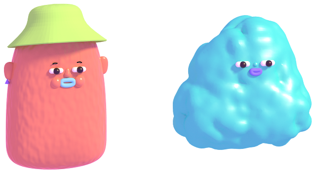
Another one of my favorite little elements of the book is the author photos — Julio is a chicken nugget, and I’m a blob.
LTPB: What did you use to create the illustrations in this book? How does your process change from book to book?
JG: I used the open source 3D graphics program Blender for this book and pretty much everything. It’s great. In terms of process, I think one area where I really pushed outside of my comfort zone was playing with light. There are some really beautiful raking lights and dramatic shadows in some of the spreads, it really feels like a semi-dusty empty apartment on a hot day.
LTPB: What are you working on now? Anything you can show us?
JG: I recently finished a short film called Tennis Ball on His Day Off which is screening at some festivals and will probably go online soon… beyond that, I’m keeping my next projects a secret for now, I don’t want to jinx them 🙂
LTPB: If you got the chance to write your own picture book autobiography, who (dead or alive!) would you want to illustrate it, and why?
JG: Wow, that’s tough! It would be a big get but I’d like Grandma Moses to do it. She’s my favorite artist, I just love the way she looks at the world, depicts the passage of time, and highlights little mundane moments. More than that I’d like to be able to look at my life and feel like I lived in one of her paintings.
A vase-sized thank you to Julian for taking time to answer some questions about this super cool book! I Want to Be a Vase published last month from Atheneum Books for Young Readers!
Special thanks to Julian and Atheneum for use of these images!

This post contains affiliate links. For more information, visit my policies & disclosures page
July 19, 2022 at 10:30AM noreply@blogger.com (Mel Schuit)


